Premier Agent Brand
Premier Agent Brand
Premier Agent Brand
Premier Agent Brand
BRAND DEVELOPMENT + VISUAL DESIGN
BRAND DEVELOPMENT + VISUAL DESIGN

With Zillow's acquisition of Trulia, two Agent advertising platforms needed to be merged underneath one cohesive brand.
Overview
We needed a new brand identity that tied back to both Zillow and Trulia. The identity needed to convey to Agents that with the merger, they can target the combined audience of both platforms via one advertising platform.
With this direction from leadership, we decided to lean heavily on Zillow's strong brand equity with Agents, while incorporating subtle nods to Trulia's design aesthetic.
DESIGN GOAL
Create a brand that conveys the merging of Zillow's and Trulia's real estate agent advertising businesses
Process
Based on user research, the color palette needed to have high contrast to ensure usability. The Premier Agent color palette also had to compliment both Zillow and Trulia brand colors since they would be displayed together in marketing.
I explored various different color palettes, below are some examples of how different palettes would translate across various touch points.
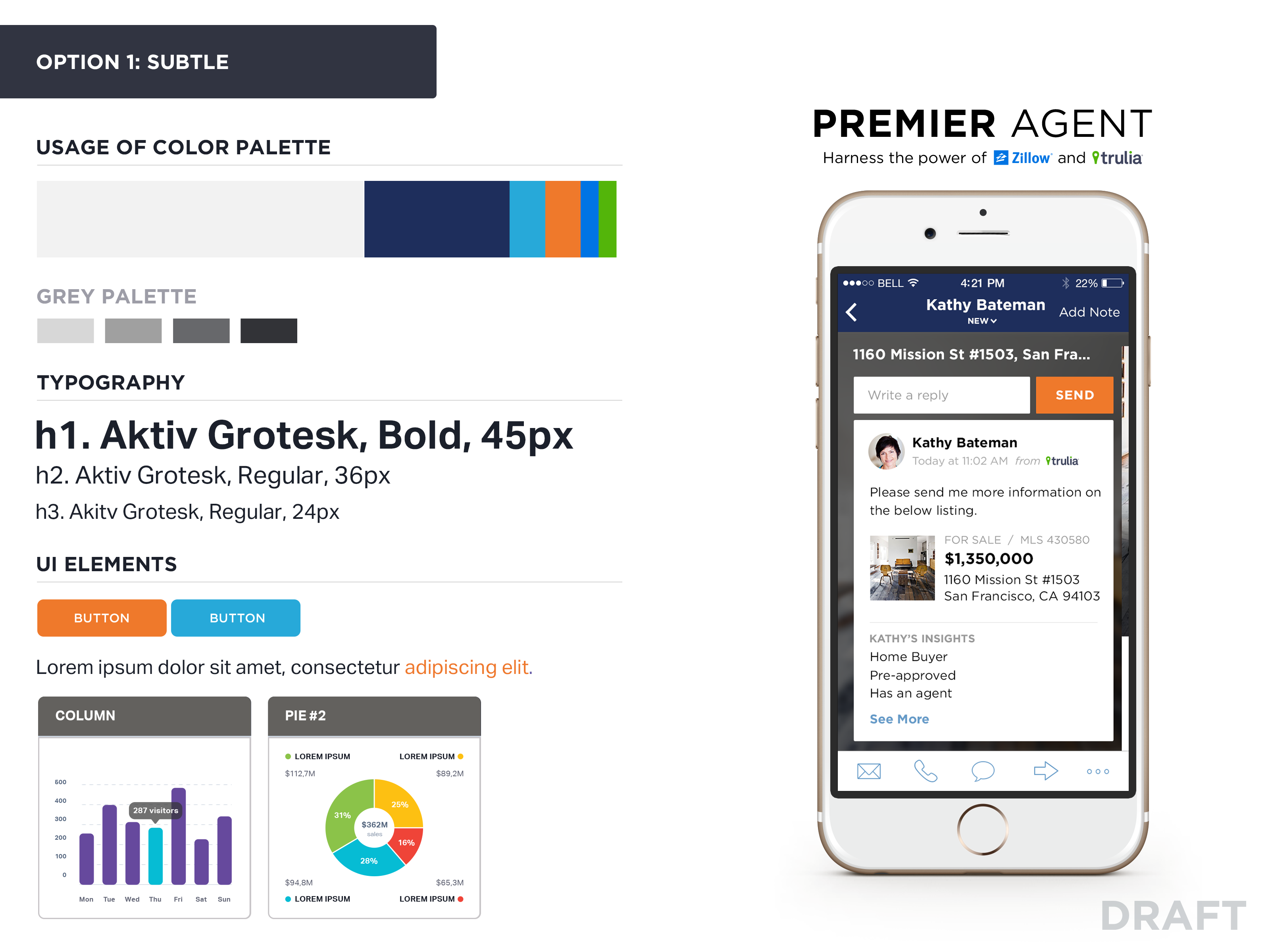
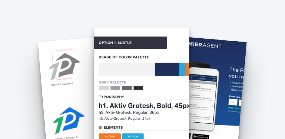
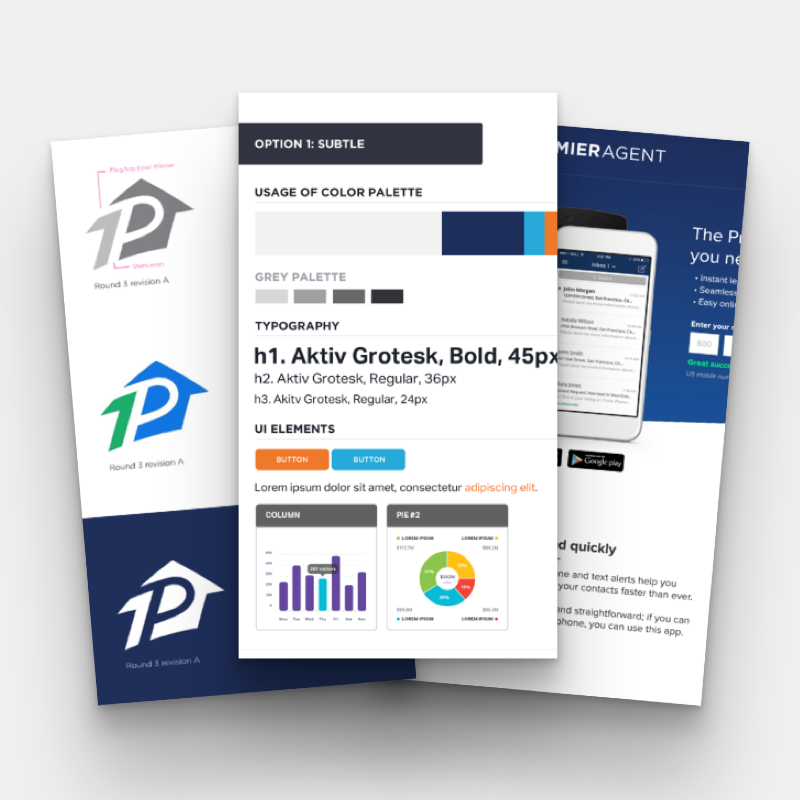
Option 1 was the more literal approach of merging the Zillow and Trulia brands. This palette took nods to both brand color palettes and with refinement, turned them into one.
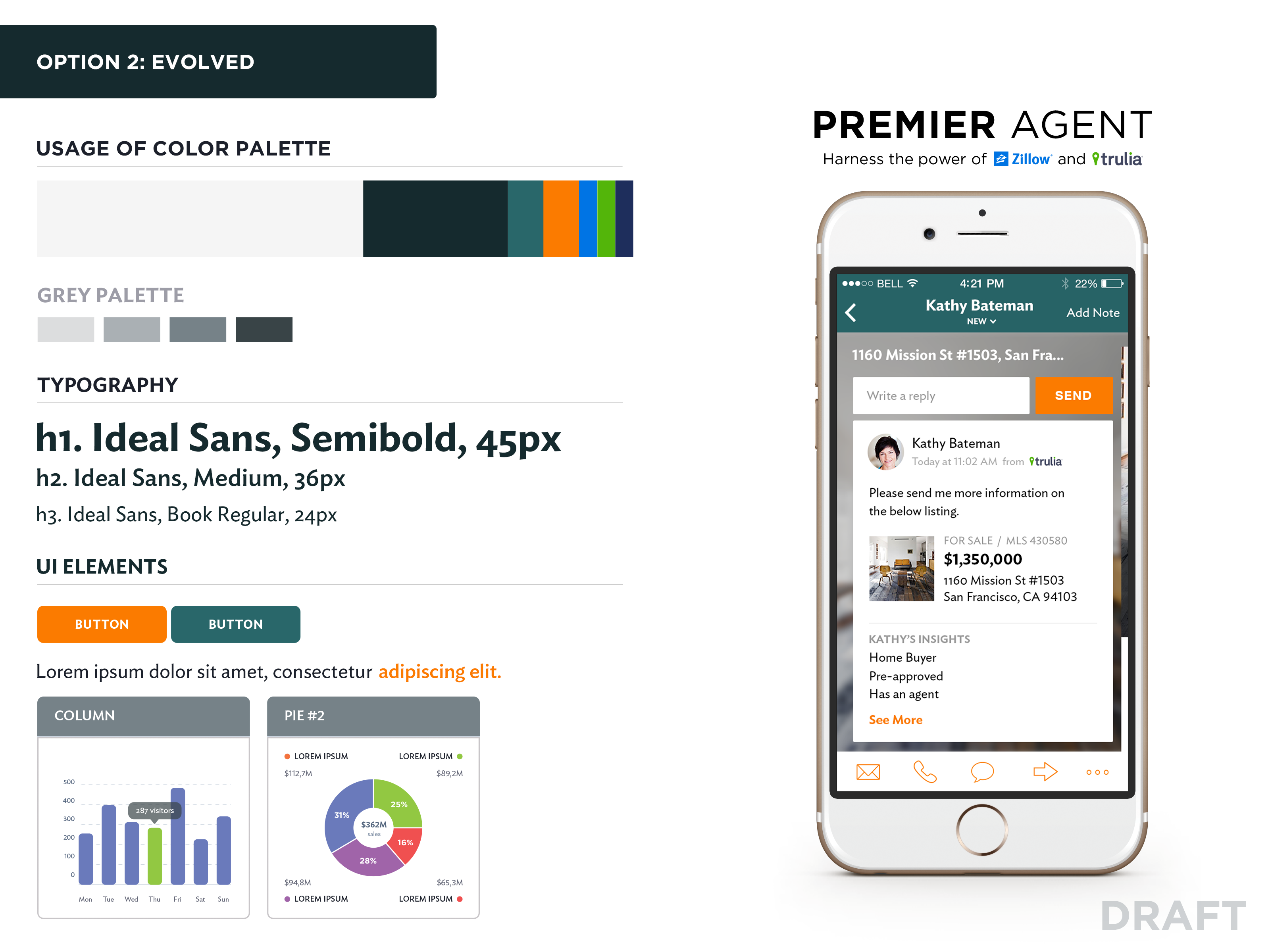
Option 2 was an exploration in mixing the Zillow and Trulia brand colors into a color palette that was more professiional and refined for the Premier Agent buisness, but still worked well with consumer branding on each company.
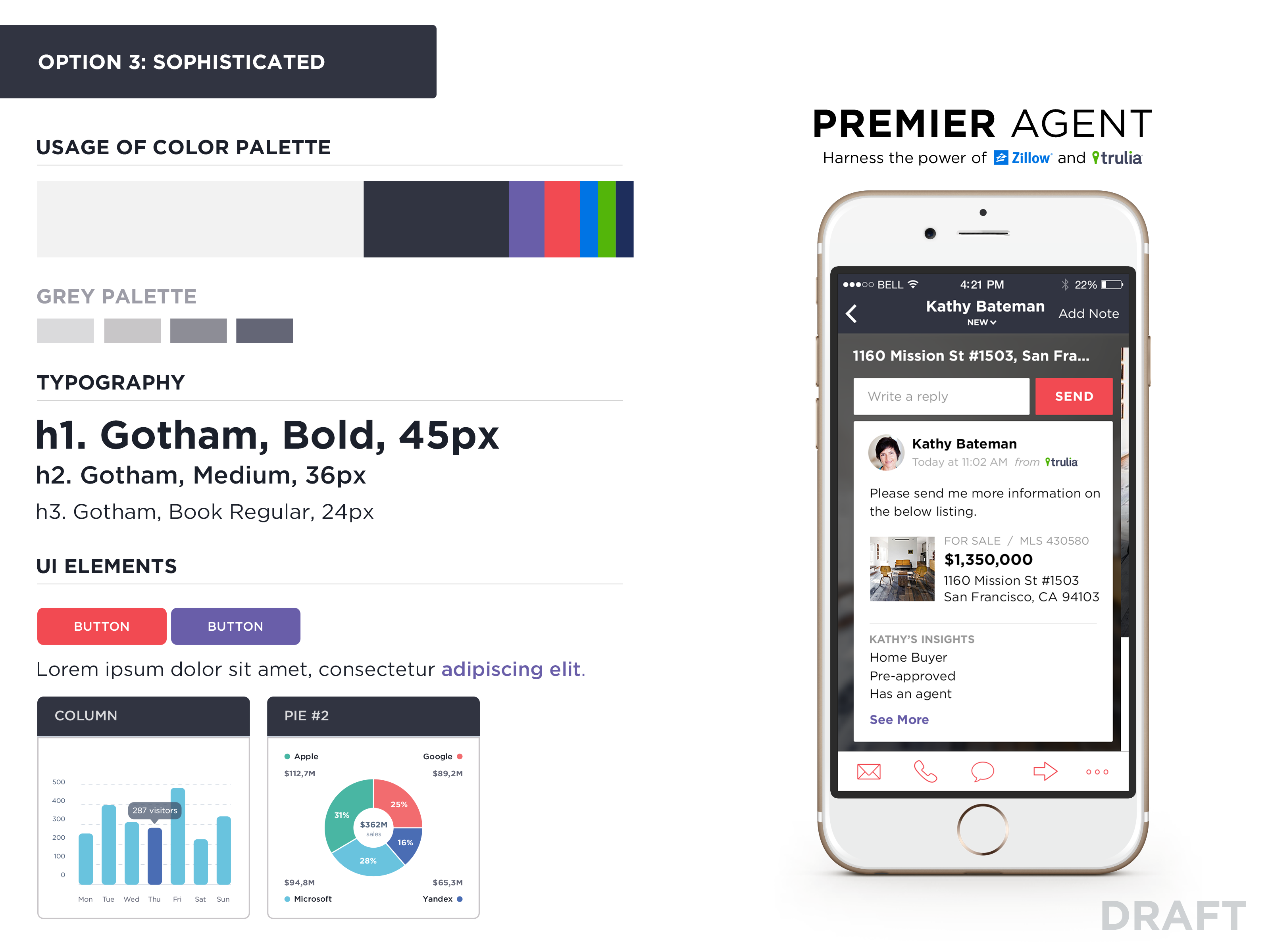
Option 3 was the biggest departure from the brand equity of the Zillow and Trulia brand, but it explored leaving both brand colors and establishing a fresh identity for Premier Agent.
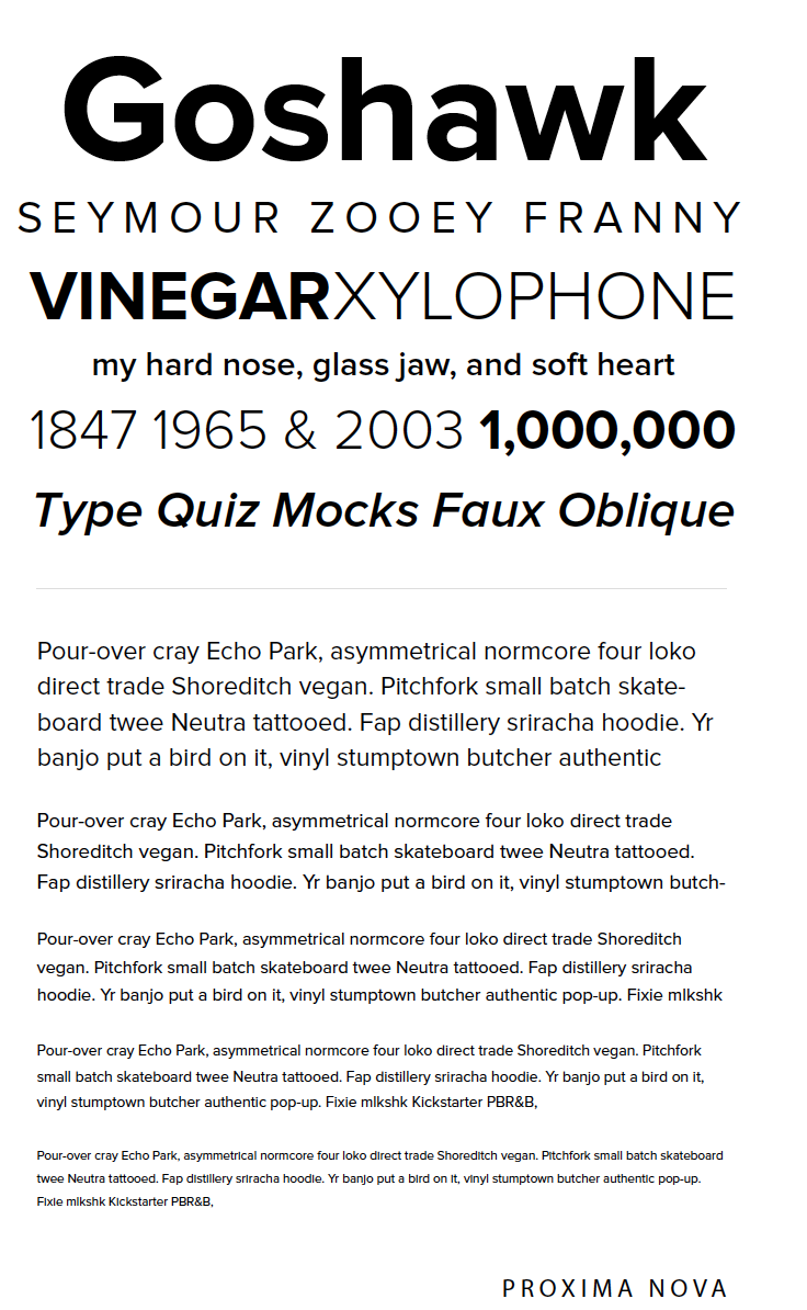
I explored type specimens of different sans-serif font.
- San-serif conveyed a more clean, approachable, and modern take on real estate.
- San-serif provided more flexiblility at smaller sizes and rendered better for Agents that might be working on older technologies with lower-resolution displays.
Ultimately, we chose Proxima Nova due to it's flexibility in weight and style variations. Also, the open, circular forms, give the Premier Agent brand a more “friendly” appearance, bringing a more modern approach to the Agent advertising business.
After consulting with a contractor, we spent most of our tight, two-month timeline undergoing multiple iterations of the final logo design to address decision maker feedback. In all, we delivered seven iterations of the final logo, polishing the contractor's original explorations to a refined corporate logo.
Final branding
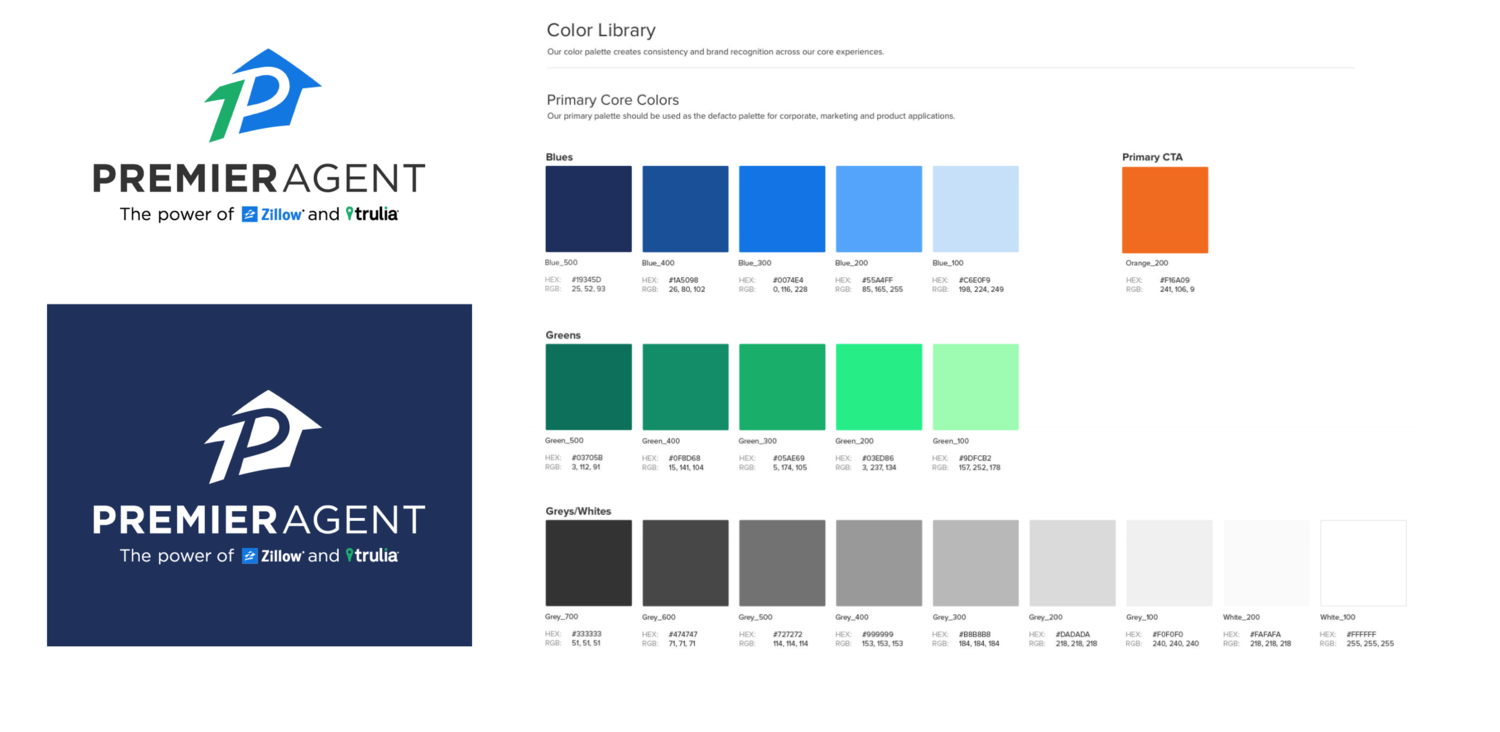
To complete the Premier Agent brand it was necessary to combine the Zillow and Trulia color palettes and introduce “The Power of Zillow and Trulia” logo lockup. In this way, we strengthened the final brand while leveraging the existing equity of both Zillow and Trulia.
We defined a elevated blue palette for dominate usage, with a secondary green palette for accents. Based on research, we introduced a performant and high contrast orange CTA throughout the product.
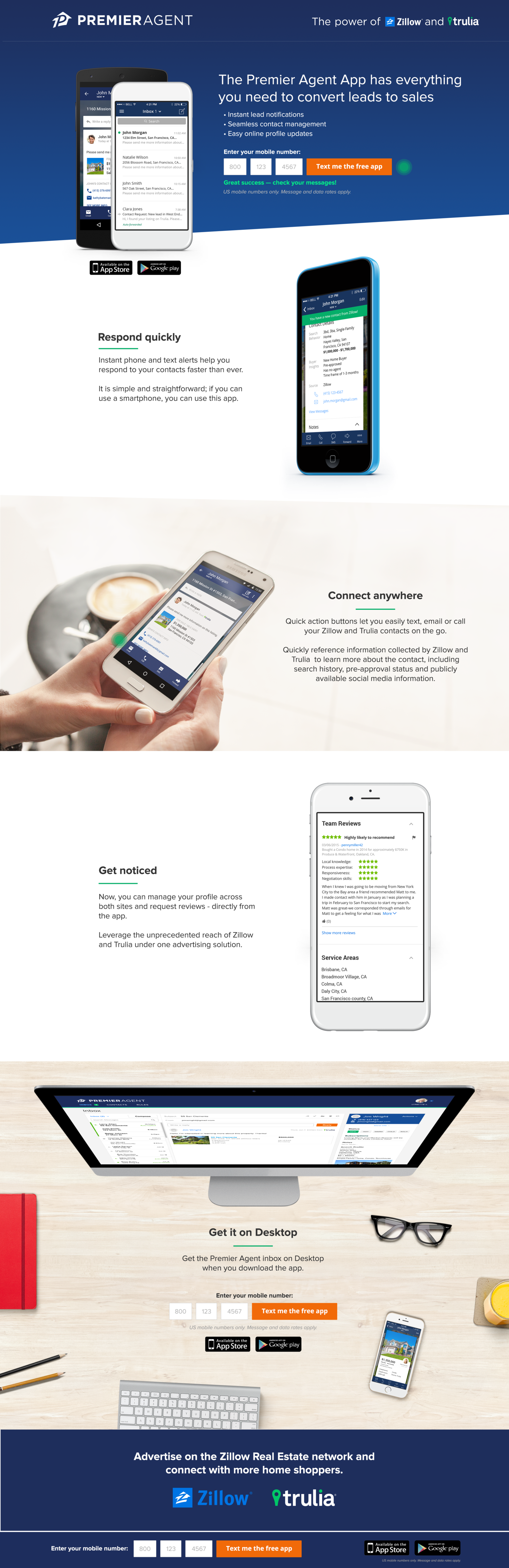
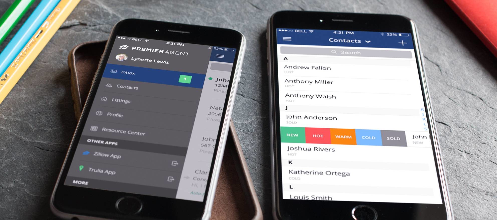
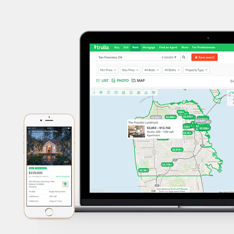
Extension of brand
Here are a few examples of how the Premier Agent brand extended throughout our product and marketing.


View more work
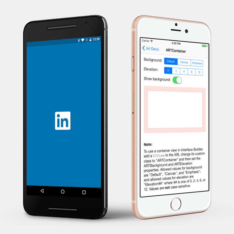
Art Deco on Native PlatformsiOS Design Lead
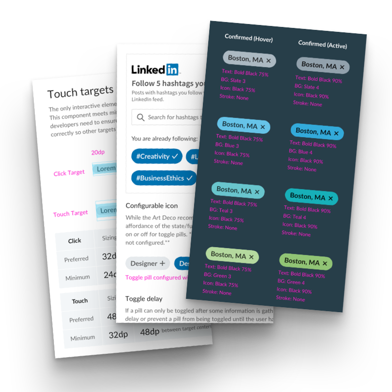
Pills - UI ComponentUI Design
Premier Agent BrandBrand Development + Visual Design
Trulia Experience Language 2.0UI + Visual Design
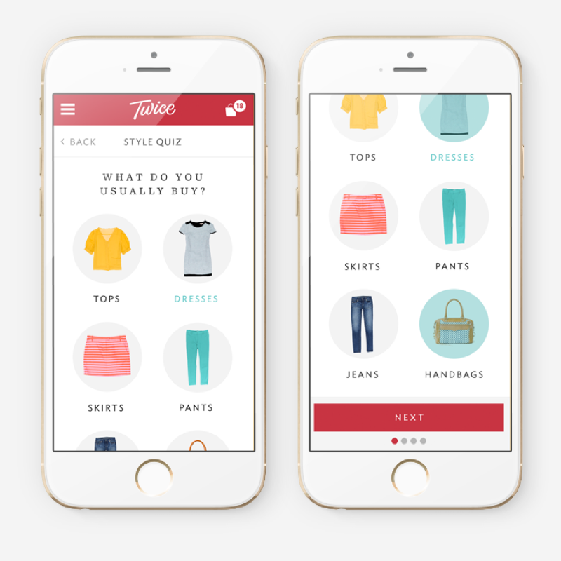
Twice Style QuizUser Experience + Visual Design
Marketing DesignVisual Design