Trulia Experience Language
Trulia Experience Language
Trulia Experience Language
Trulia Experience Language
USER INTERFACE + VISUAL DESIGN
USER INTERFACE + VISUAL DESIGN
USER INTERFACE + VISUAL DESIGN
Trulia is an online real estate site that makes finding a home easy and enjoyable by providing home buyers, renters, and sellers the insights they need to make informed decisions about where to live.
Overview
Trulia Experience Language (TXL) is a CSS style guide which promotes code reusability, rapid development, and maintainability.
For this project, I was responsible for designing the UI components in our design language. I partnered with our brand design and two engineers to modernize the UI, refactor code for higher efficiency, and add new components to the design language.
DESIGN GOAL
Modernize Trulia’s design language across all platforms without negatively impacting metrics
Modernize Trulia’s design language across all platforms without negatively impacting metrics
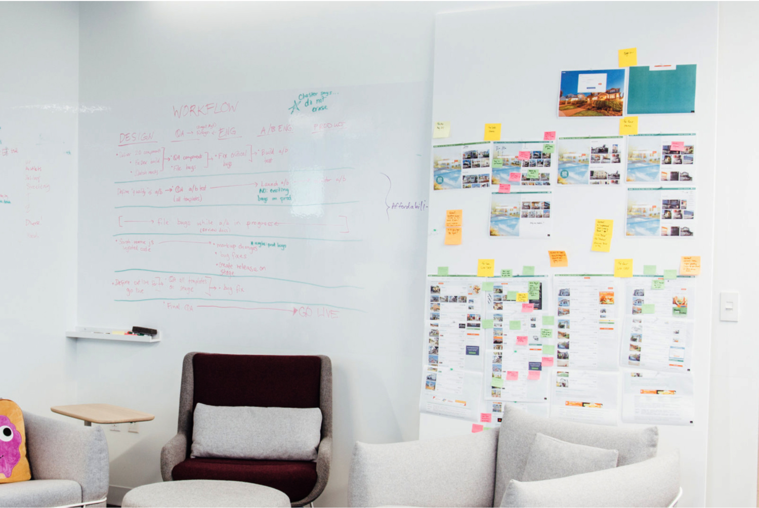
Process
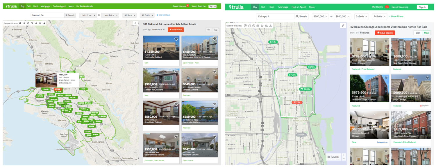
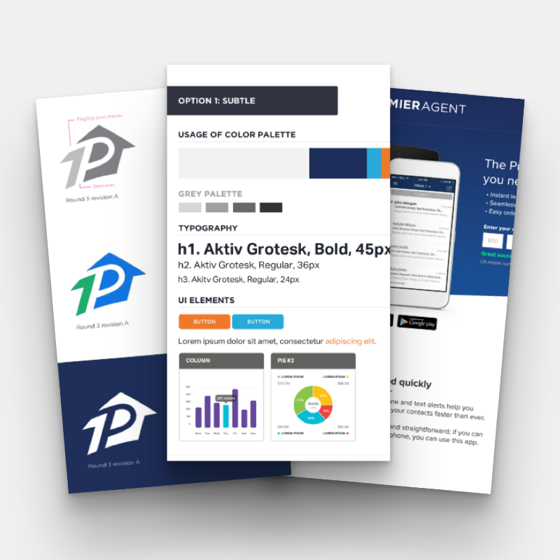
We started by auditing the current design language and identified components that were widely used across the site. We then focused on a a one-to-one conversion of all of the design components (type, color, buttons, icons, etc.) and mocked up the main user flows with restyled UI.
We iterated on various different component designs and posted mocks to make sure each of the components worked together and fit our new brand tenants (clean, authentic, fluid, delightful, etc.).
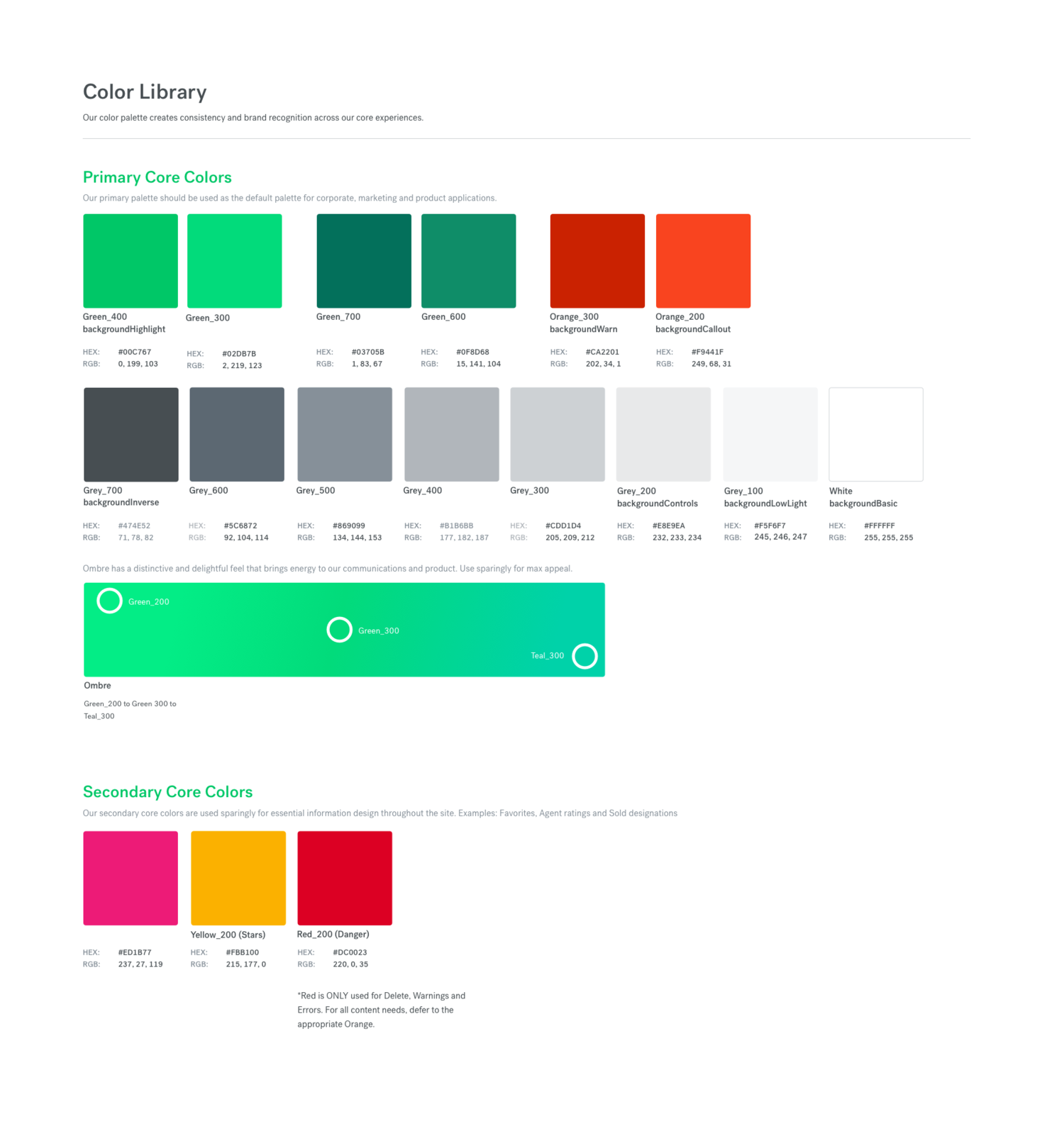
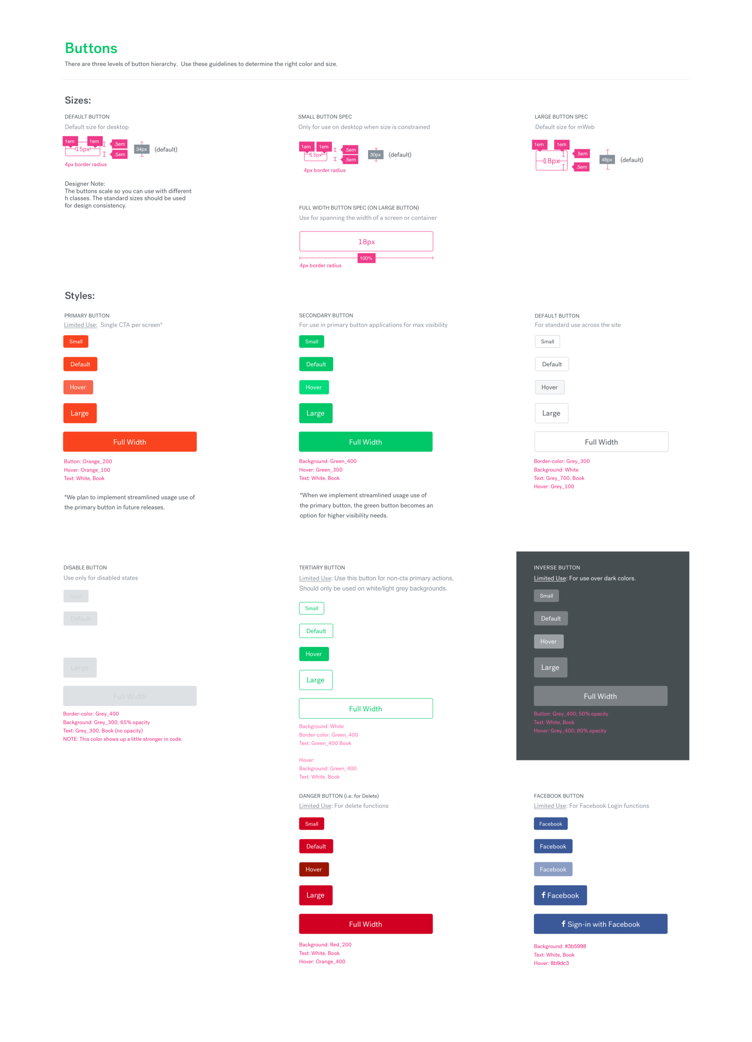
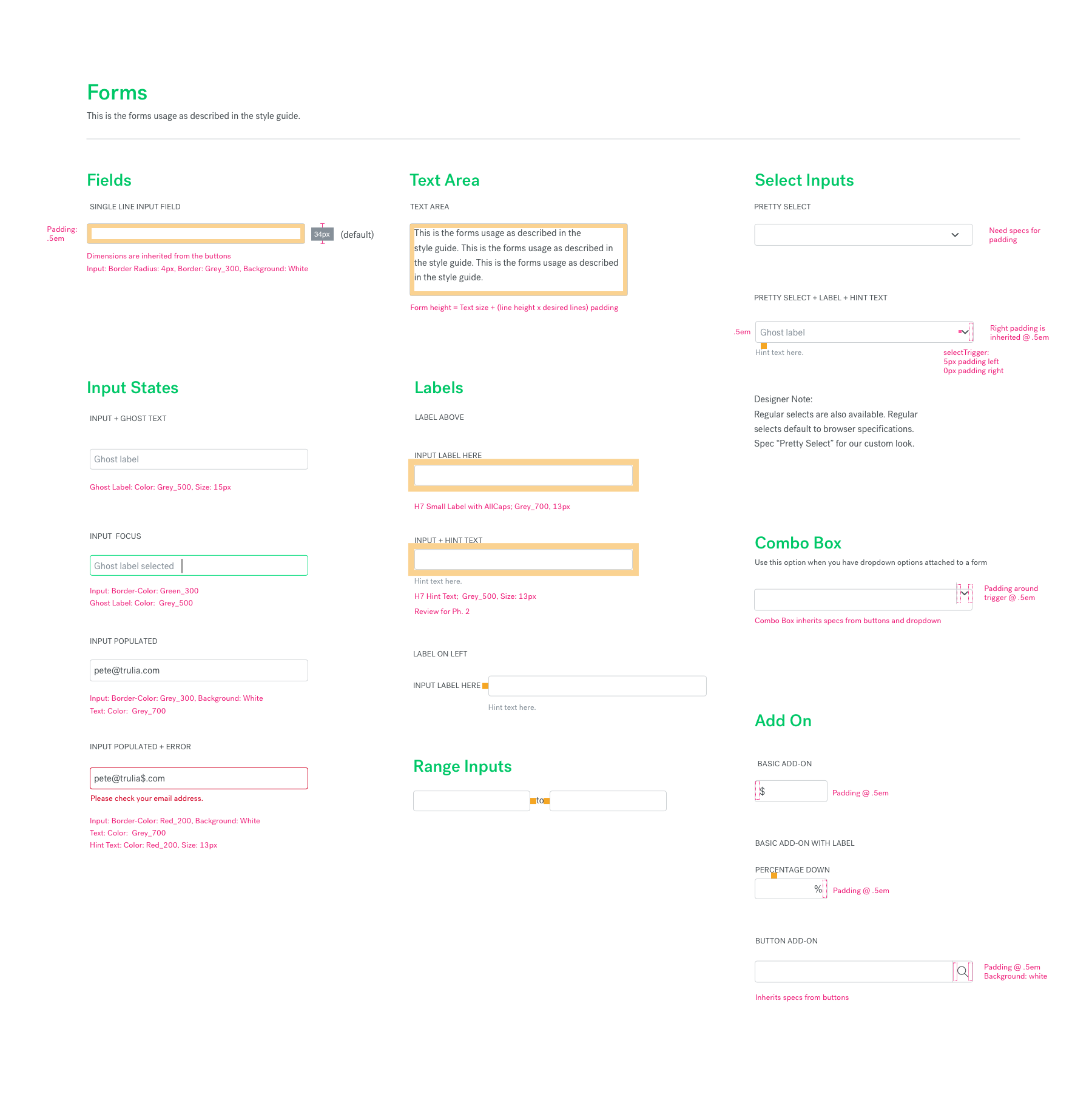
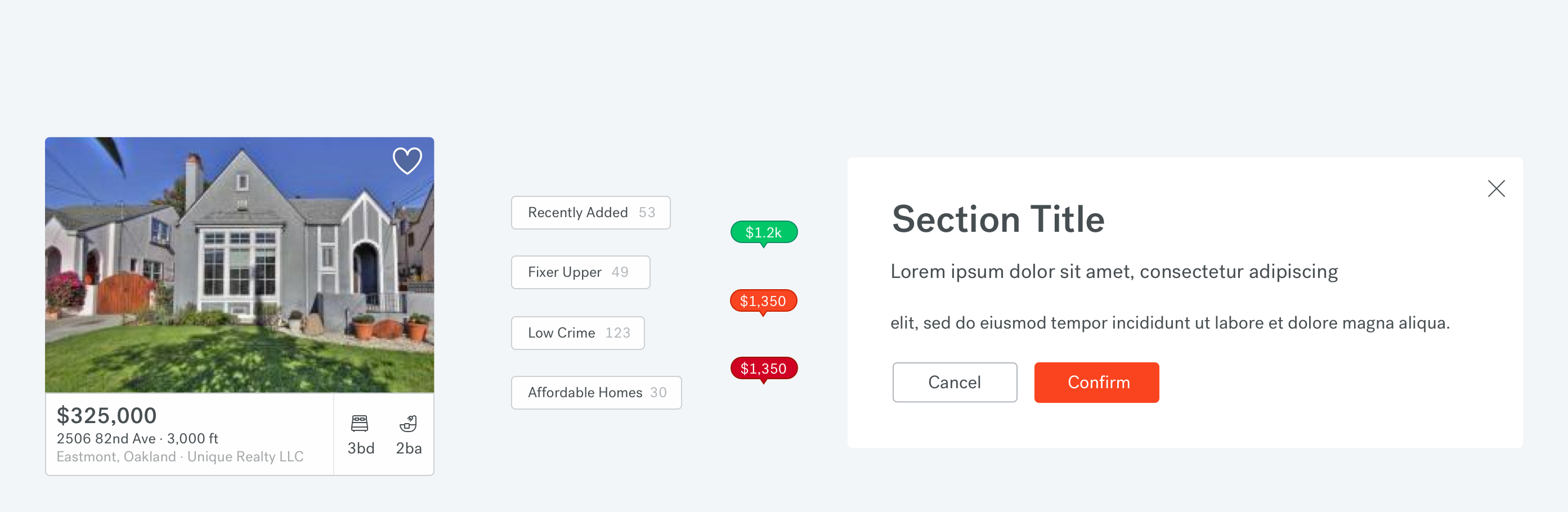
Here are a few examples of the Trulia Experience Language (TXL) design documentation. This was maintained in a shared Sketch document for designers to simply pull UI elements into their files.
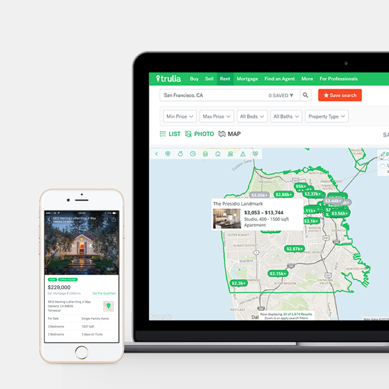
Desktop experience
Results & metrics
Through out our research we found that new design increased the user's perception of Trulia.
Improvements to business critical perceptions of new TXL:
Easy-to-use: 59% (+11% from old design)
Useful: 53% (+6% from old design)
Clean: 52% (+5% from old design)
Boosted NPS:
The TXL 2.0 refresh represented an overhaul in the look-and-feel of our product. The refactoring of our code and the refresh of our visual design lead to improved site speed and boosted our over NPS by 10 points.
35% increase in lead submits for rental business.
Increased lead conversion:
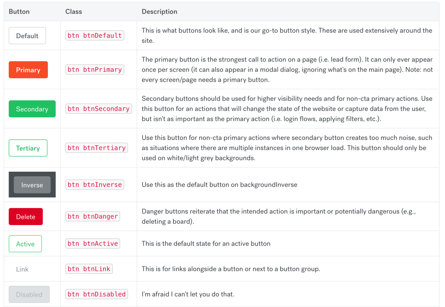
The Trulia UI was button-heavy in areas. We made strict button rules, in an effort to bring more clarity to our users; there should never be more than one primary (orange) button on the page—this was a departure from how they were previously used.
We tested this on Trulia's Rentals Search Results Page (SRP) was one of the first pages on which we tested these changes and saw a 35% increase in leads sent to property managers.
View more work
Art Deco on Native PlatformsiOS Design Lead
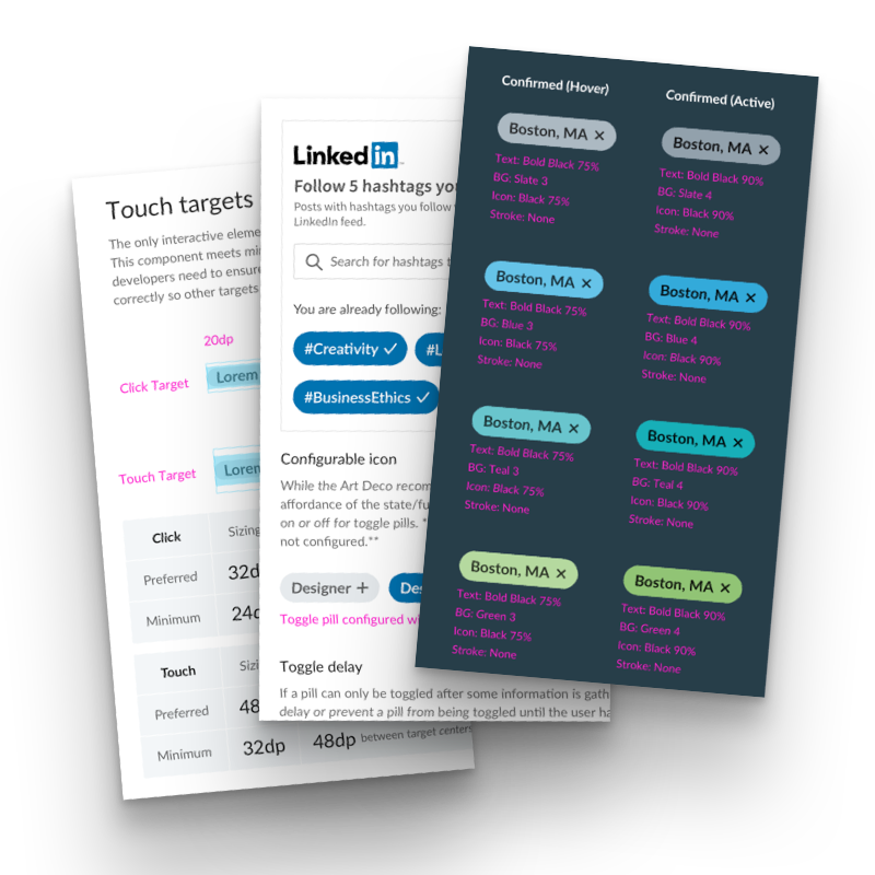
Pills - UI ComponentUI Design
Premier Agent BrandBrand Development + Visual Design
Trulia Experience Language 2.0UI + Visual Design
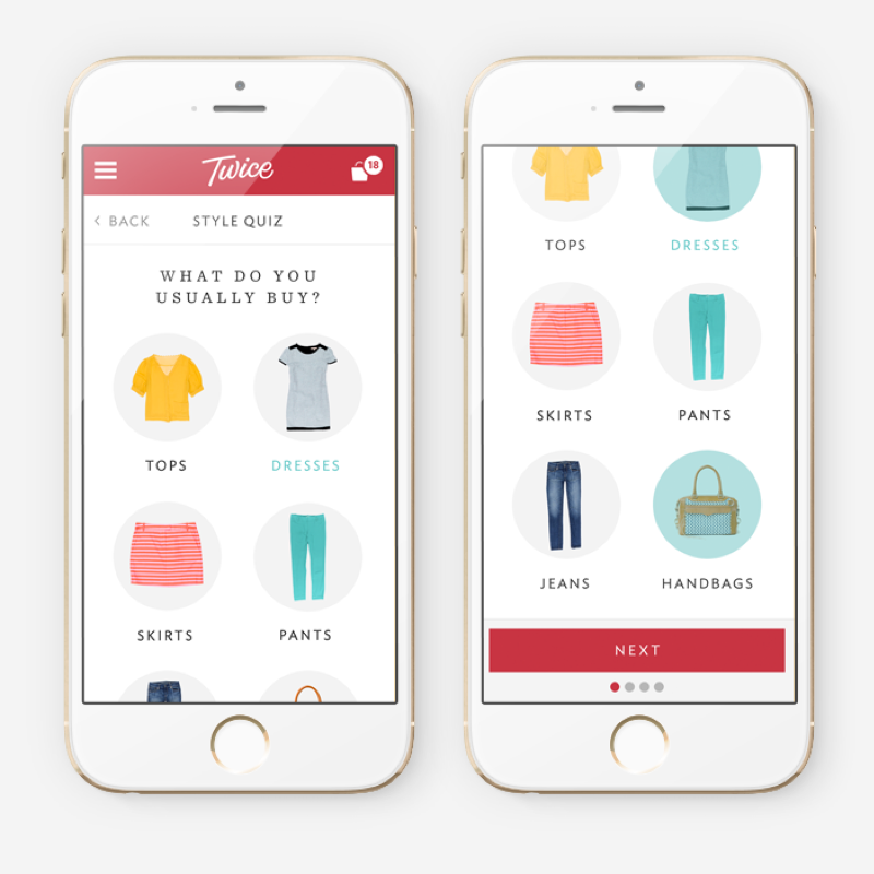
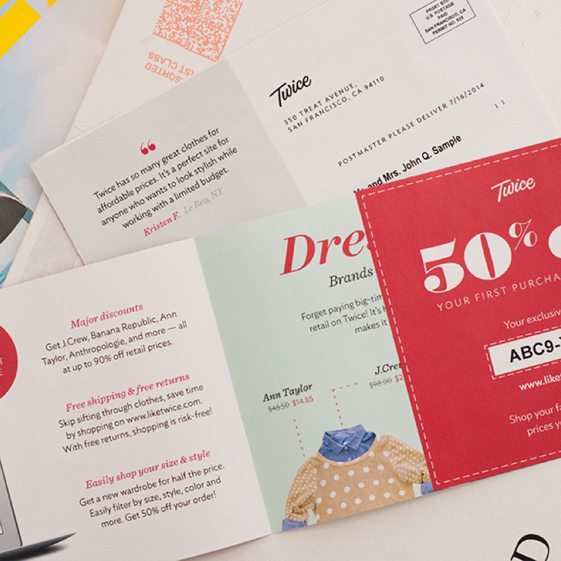
Twice Style QuizUser Experience + Visual Design
Marketing DesignVisual Design